Role:
UX/UI - Design
Google Professional Certificate Project
Duration:
2022 - 6 Weeks
Tools:
Figma, Adobe Photoshop, Blender
Challenge
This was the first project that I did for the Google Professional Certificate course. It was an exciting first journey through the Design Thinking Framework.
CinemaDevine is the app of a fictitious cinema company with several cinemas in Austria. The challenge was to find out what the users' needs and pain points were, to learn from these and to create an app that solves these problems.
My high-level goals were to:
- Create a simple and intuitive user experience.
- Data-driven solutions for the problems and needs of customers.
- Design a unique branding.
Solution
The first interviews made it clear that movie ticketing apps were not popular among participants. Complicated user interfaces, an inundation of advertising, and non-transparent prices were the primary pain points.
A user-centric seamless experience was the goal of the whole journey. I decided to break up the typical hero section layouts and make the design a little more restrained. It should be all about the movies and the simple user flow.
For the branding, I didn't want to use typical cinema app colors like black and red. That's why I went a different way here to make a memorable impression.
Show PrototypeMy Role
As the lead product designer for this project, I was solely responsible for its development. This project was done as part of Google's professional certification program, which meant that I embarked on the design journey without the support of a dedicated team to collectively engage in the design thinking process.
Design Thinking


1. Empathize
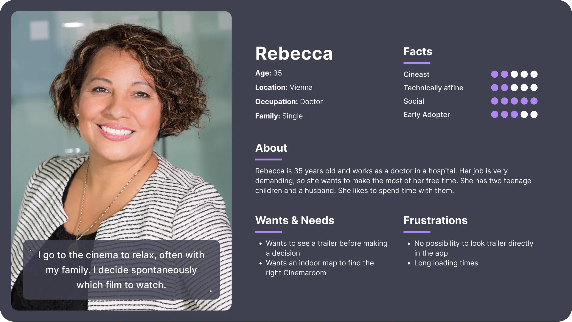
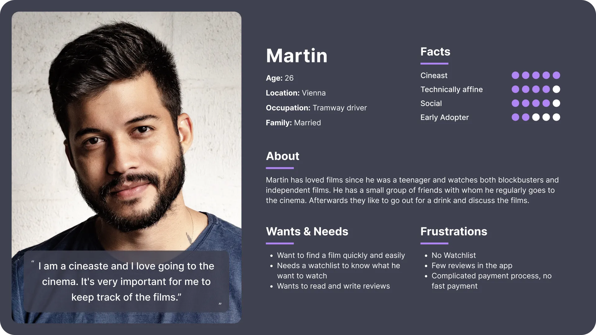
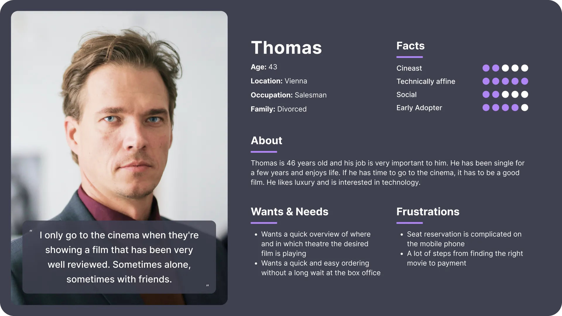
To understand my targeted users, I first conducted personal interviews to identify their needs and to put them in focus. The goal was to get a deeper understanding of their behaviors, needs, and motivations. Afterwards, I created data-driven personas, which I believe can be an important tool to better empathize with the users.
Interviews
I interviewed a total of 10 people which were mostly my friends and relatives. I tried to interview both younger and older people. This gave me a certain diversity of professions and types of moviegoers.
The biggest challenge here was that I had to ask unbiased questions and keep my own body language neutral despite my nervousness. I succeeded well because I prepared my questions very actively and I was able to shake off my nervousness relatively quickly.
During the interviews, I quickly realized that cinema apps are always associated with a certain level of annoyance and frustration. The biggest pain points were that the existing cinema ticketing apps often have complicated user interfaces and are swamped with advertising. Quick ticket ordering is rarely possible, which is why a significant proportion of participants do not use an app, preferring to stand in line at the cinema. The non-transparent prices have been criticized both in the app and directly in the cinemas, as there are often surcharges of all kinds that cannot be estimated in advance.
Personas
The first time creating personas was difficult at the beginning as I felt the 10 interviews provided too little input to create truly diverse personas. I had the feeling that the Google course gave too little information on how to create personas correctly. So, I had to do some more research and got some very good information from NNGroup and Medium.com
about how important it is that personas are data driven. It would probably be best to have both quantitative and qualitative data when creating personas. When creating the personas, I paid attention to the most common themes in my data and was able to put the users into groups.
2. Define
Now my journey led me to the define process. After creating the personas, it was time to create user stories and user journeys. Then I wrote the problem statements based on the personas.
Problem Statements
Rebecca is a hardworking family woman who needs an app that's quick and easy to use because she doesn't want to wait in line, rather she wants to spend time with her family.
Martin is a cineaste who needs an app with lots of good features that is easy to use because he goes to the cinema a lot with his friends and wants to save time.
Thomas is a businessman who needs an elegant and simple app because he loves luxury and only goes to the cinema to see the best movies.
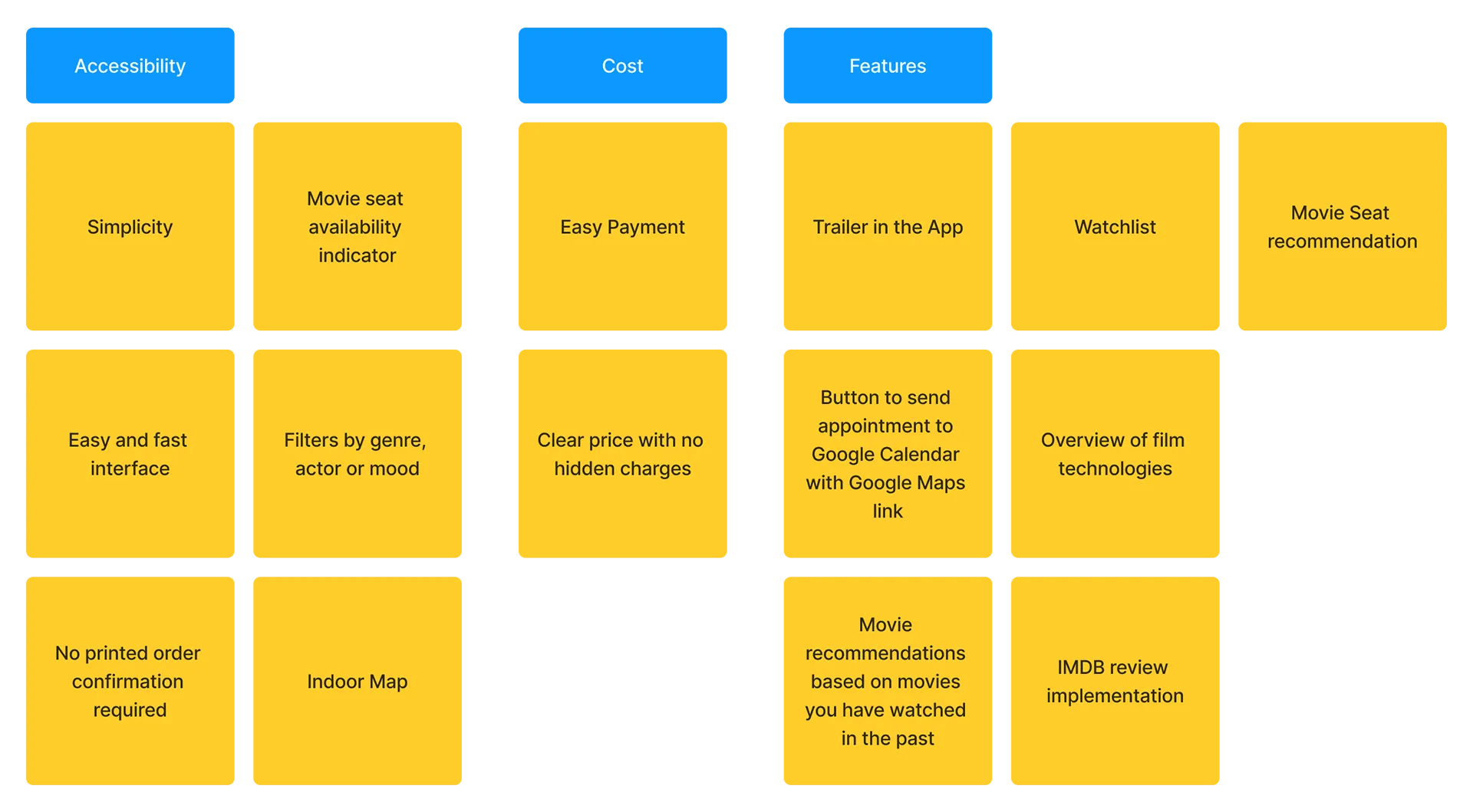
Value Proposition List
The challenge was to come up with ideas for why people should use the product. I created a long list of digital post-its, which I then narrowed down to the needs of the users.
I grouped them into three categories: Accessibility, Cost, and Features.
3. Ideate
This brought me to one of the most exciting phases of the process, the generation of a broad set of ideas. I would have liked to do this in a team, because I think that this can have much more impact than if you do it alone. Unfortunately, this was not within the scope of possibilities of the course.
In addition to intensive brainstorming and storyboarding, I also conducted a competitive audit to find out where the competition's strengths and weaknesses are and where the app's opportunities lie.
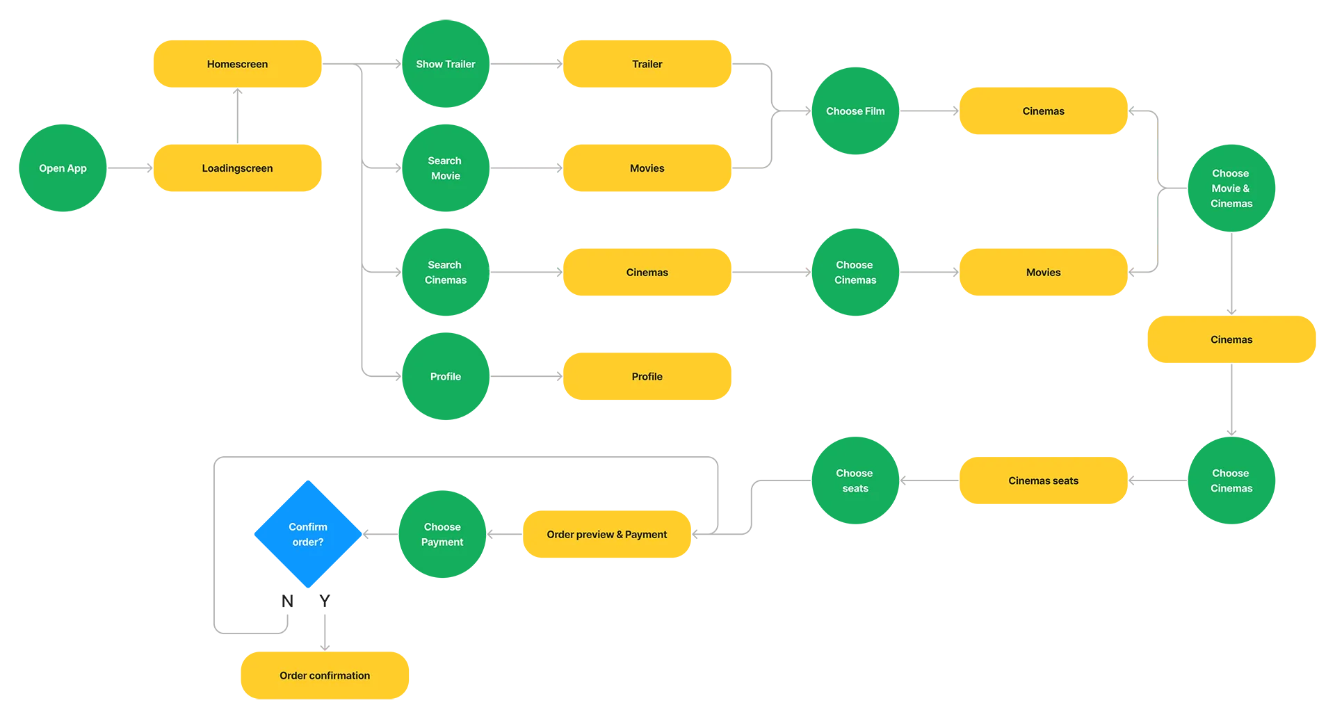
After that, it was time for me to plan the user flow. Here I focused on short and simple ways to make ordering tickets as easy as possible.
Competitive Audit
When creating competitive audits, it is important for me to be aware that creativity can be limited. That's why I created the brainstorming before the competitive audit to not be so distracted by the features of the competition.
I particularly focused on the competition in my native Austria, where the spotlight is not so focused on user experience. There is little awareness of good UI and many design principles are outright ignored. Even the largest cinema company (Cineplexx) does not reflect the needs I found in my interviews. Especially at Megaplex, there is still a lot of work to do to improve the user experience.
Detailed competitive audit| Cineplexx | Megaplex | Gartenbaukino | film.at | |
|---|---|---|---|---|
| Competitor type | direct | direct | indirect | indirect |
| Business Size | large | medium | small | small |
| Target audience | General public | General public | Film enthusiasts | Streaming preference people |
| Unique value proposition | Widely used and always at the cutting edge of technology | Affordable cinema enjoyment | Historic cinema with many special events and film festivals | Streaming from home |
| Features | Outstanding | Okay | Okay | Good |
| Accessibility | Need work | Need work | Need work | Need work |
| User Flow | Outstanding | Need work | Okay | Outstanding |
| Navigation | Outstanding | Need work | Okay | Outstanding |
| Brand Identity | Outstanding | Need work | Outstanding | Good |
| Tone | Fun and indirect | Friendly and indirect | Serious and direct | Friendly and indirect |
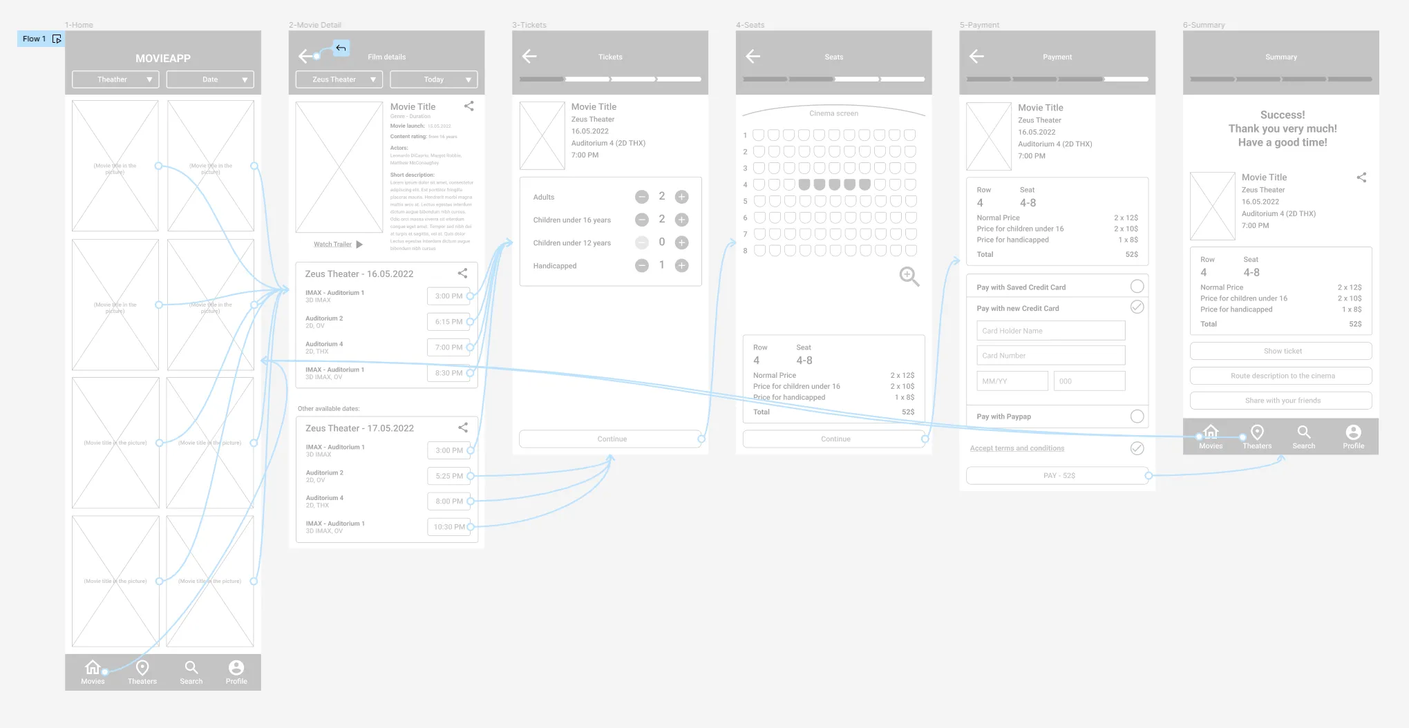
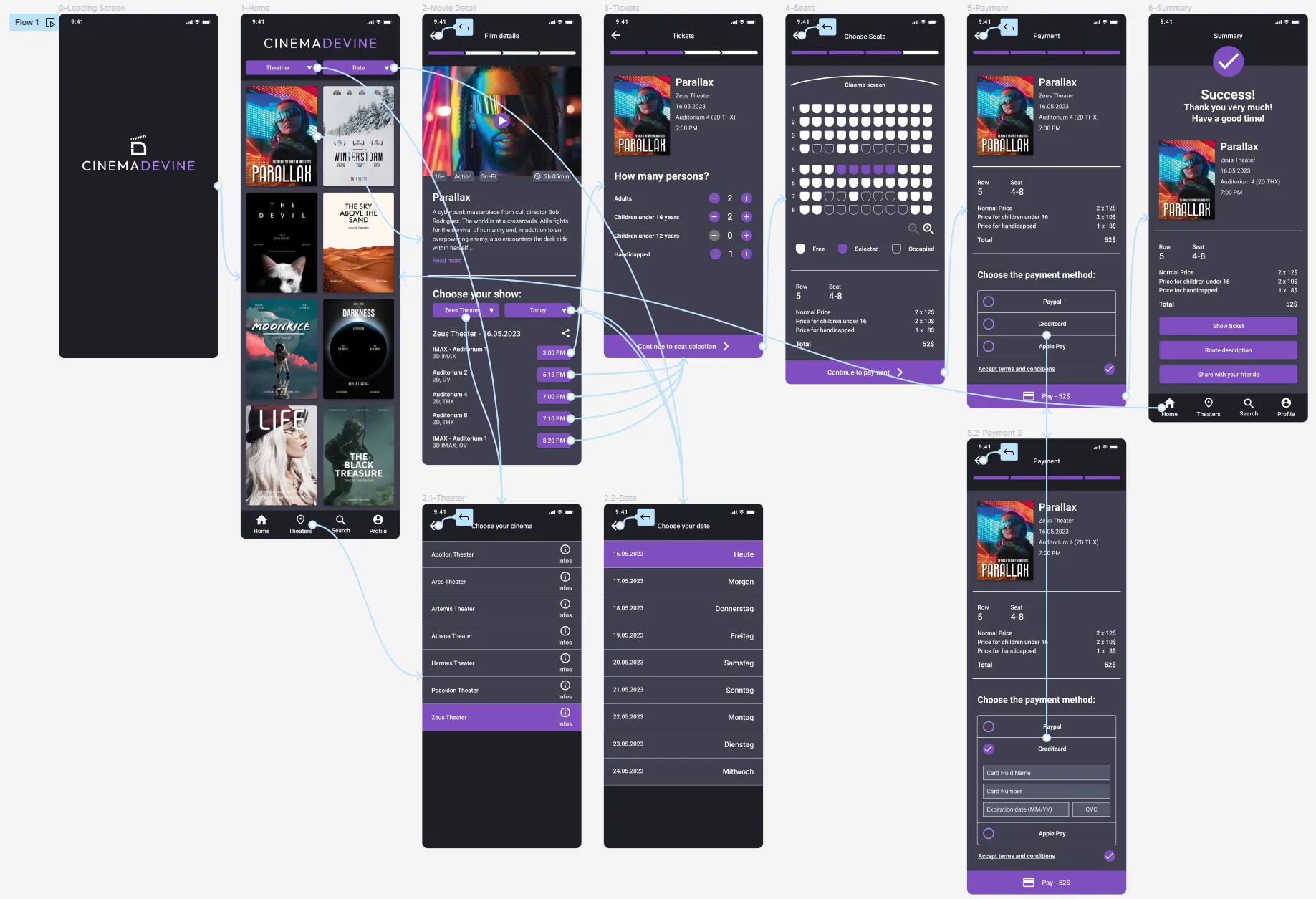
User Flow
4. Prototype
After the exciting idea search, it was time to create wireframes and prototypes. I found this process easy and fun. The paper wireframes were a new way for me to develop ideas.
Paper Wireframes
This part didn't take long, as I had a very good idea of what my first digital wireframe might look like. The paper wireframe method gave me the opportunity to quickly pinpoint a lot of ideas.
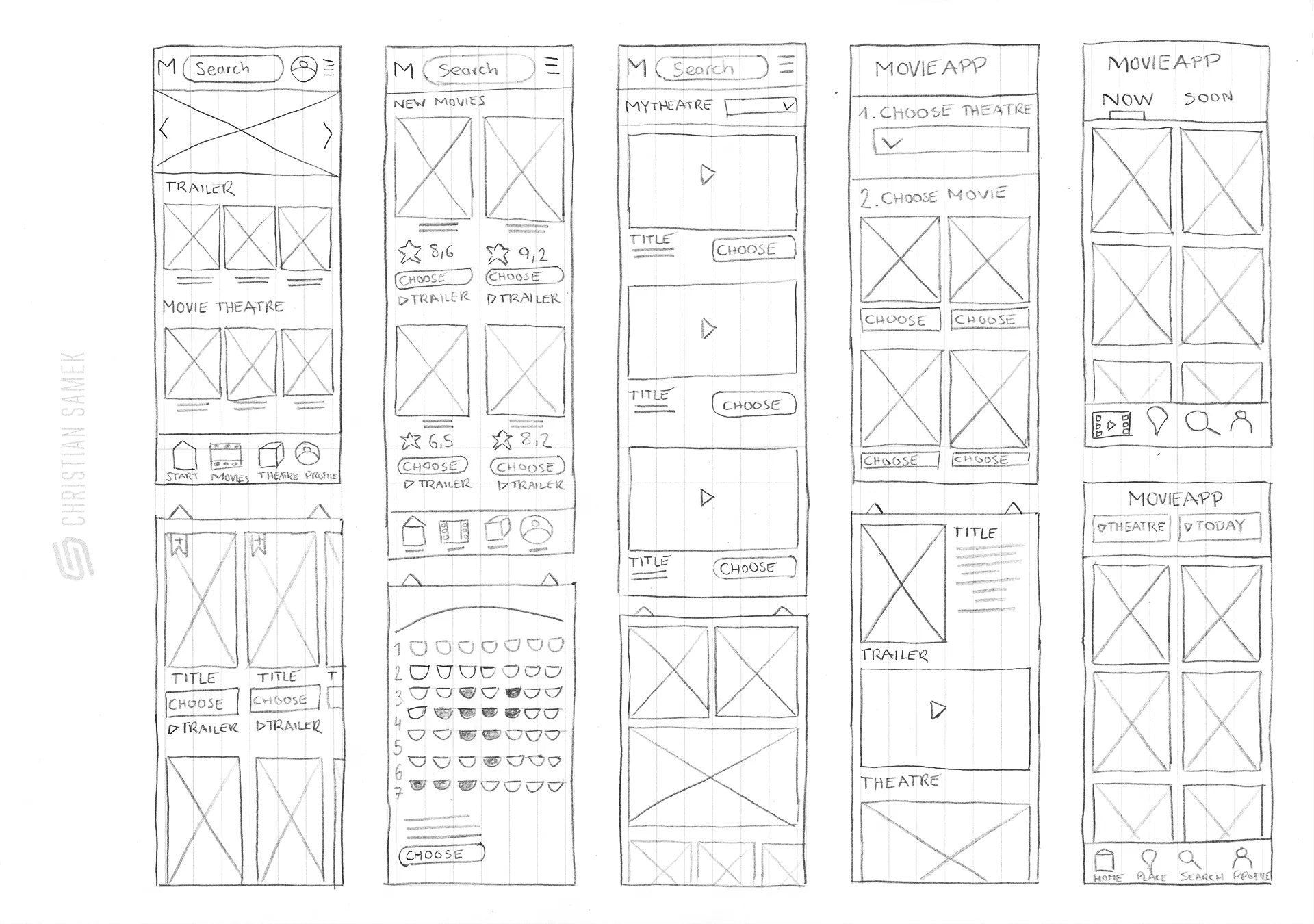
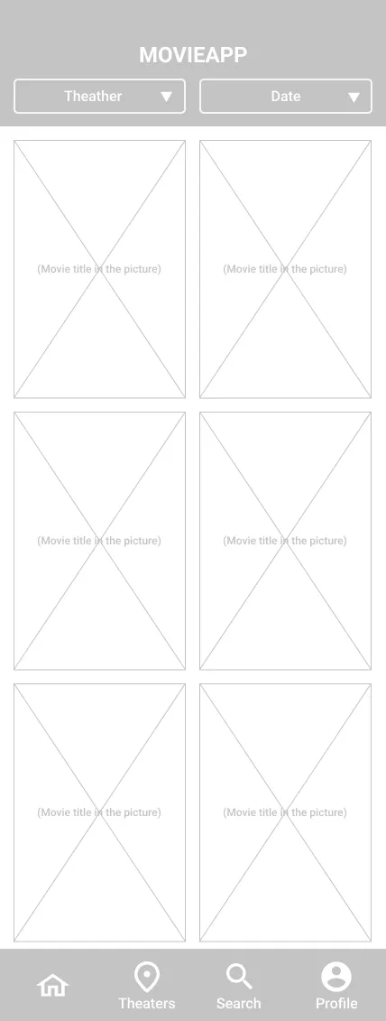
Digital Wireframes
I then used Figma to create a low-fidelity digital wireframe. It was important for me to integrate the findings of the empathize phase and to complement them with the results of the ideate phase.

Digital Prototype
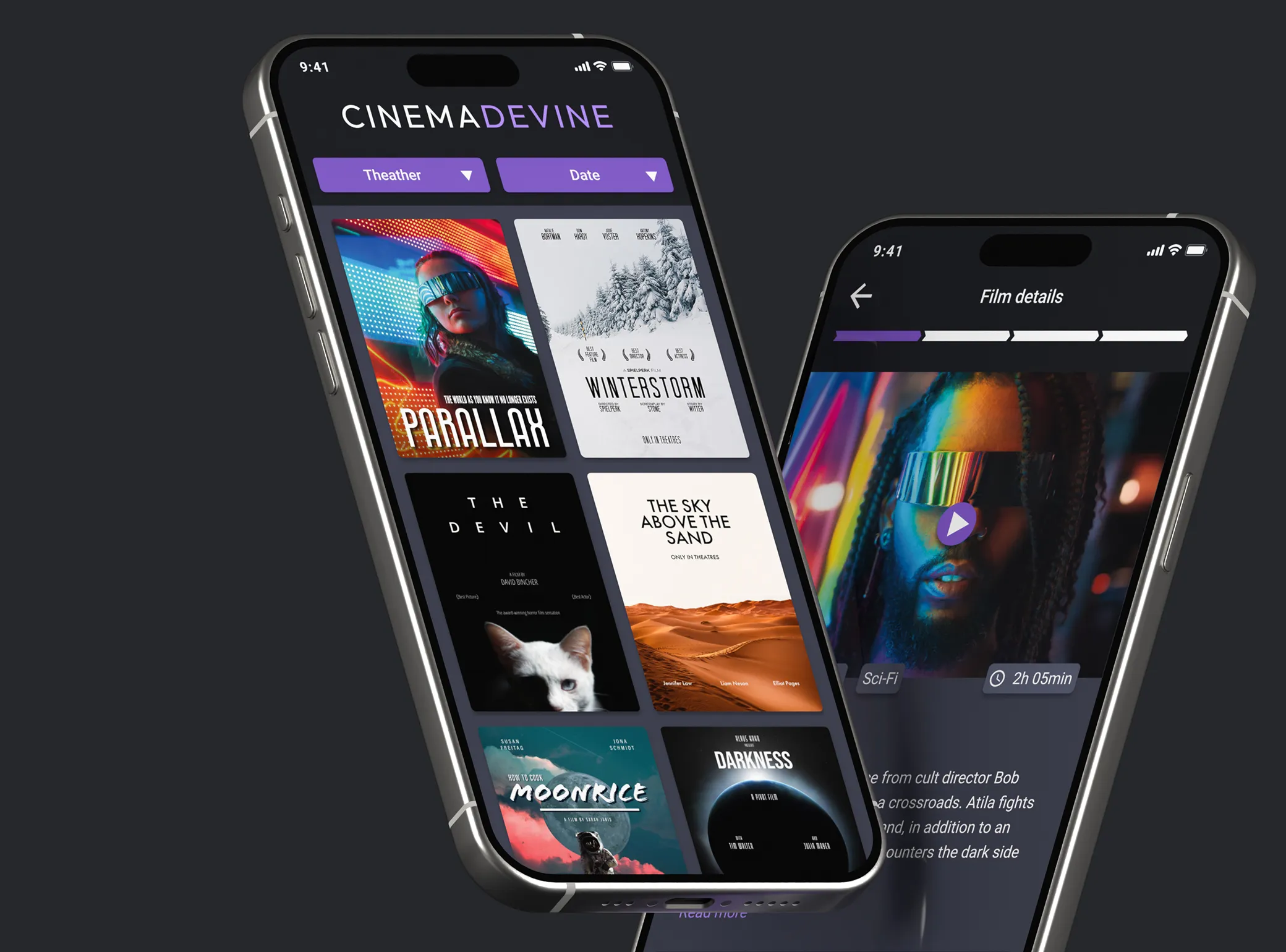
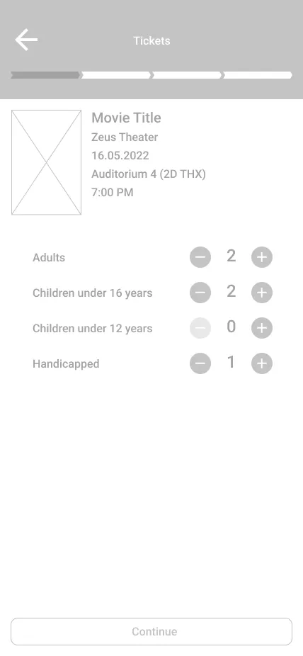
I decided on a very minimalist start page for the app, concentrating on the most essential features. A hero section might look fancy, but in my opinion, it doesn't need any additional attention because the movie selection is very clear.
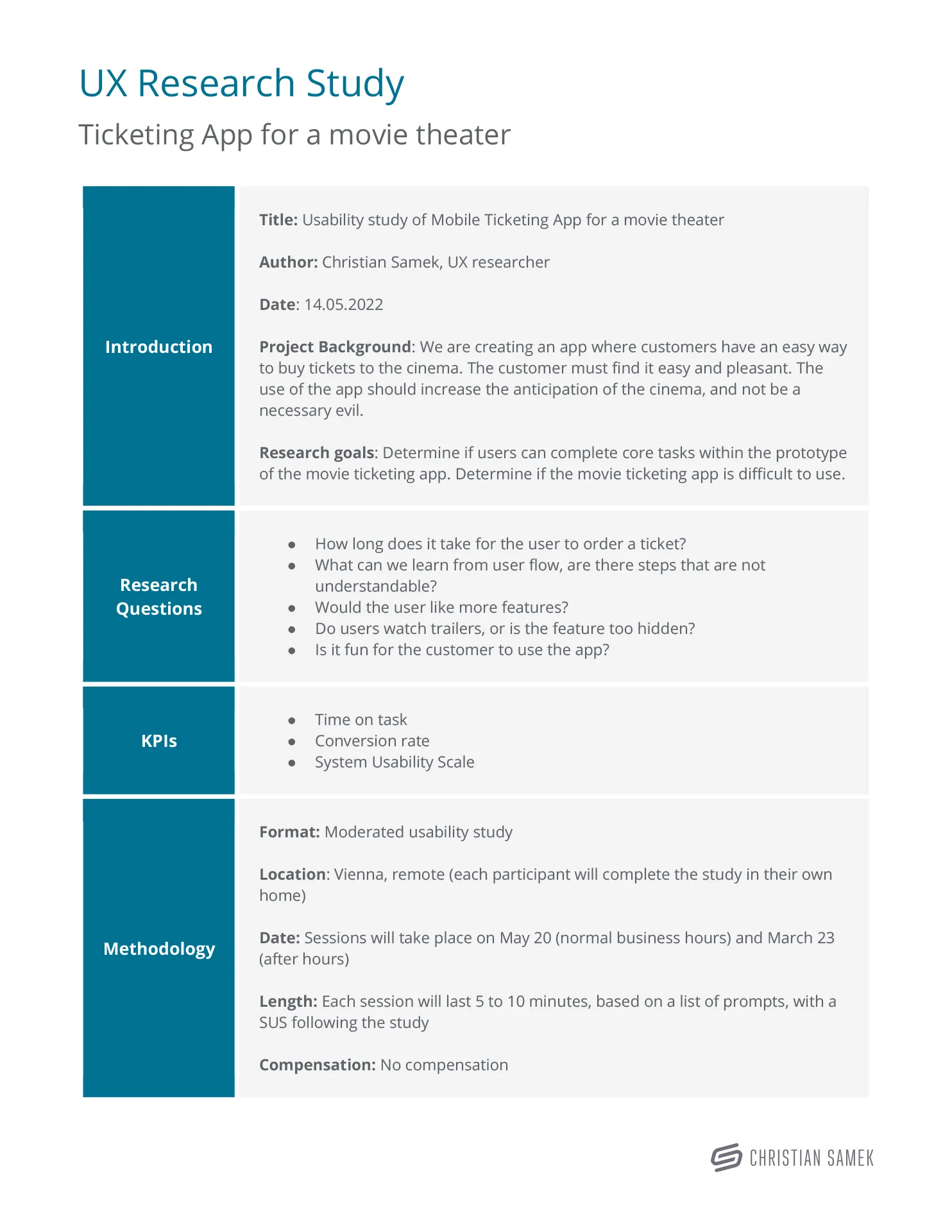
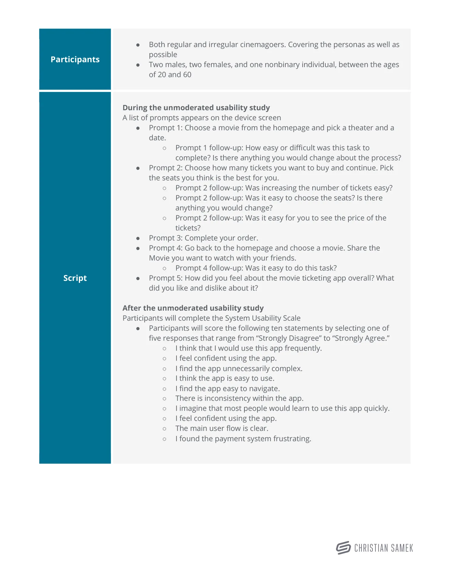
5. Test
Now the journey entered the final stage of development, testing if the product works as expected. To do this, I prepared a UX research study that would give me good insights. This step was very exciting, as it was a challenge to ask the right questions and make the right observations.
UX Research Study
Once again, I studied the topic of bias in order to create a good usability study. I was very careful with my choice of words and tried to ask the right questions. The format was moderated and remote. I used Figma, Google Meets and Google Slides to conduct the interviews. In total, there were five interviews that gave me an insight into my work.
Affinity Diagram
After the UX research study it went on to synthesize and organizes the data into groups with common themes or relationships. Three themes emerged: back to home, summary, and order process. These provided the insights I was looking for.
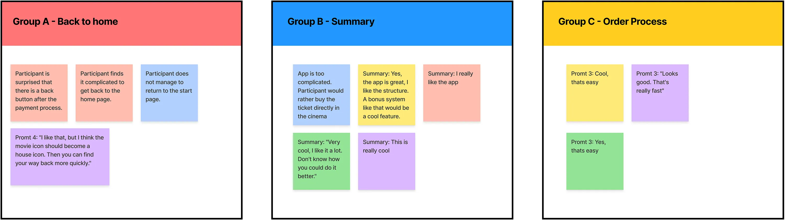
Research findings & Improvements
The feedback was very positive. Most people found the prototype very appealing and were amazed at how intuitive and uncluttered it could be. Some were a bit disappointed from the lack of colors and images in the prototype.
Pattern Identification
- It was observed that 3 out of 5 participants had problems returning to the start page after the order process. This means that the home button is difficult to find for most of the user.
- It was observed that 4 out of 5 participants liked the app and would use it in the future. This means that that the app is useful for most users.
- It was observed that 3 out of 5 participants found the ordering process simple. This means that the majority of participants found the process easy.
Insight Identification
- Based on the theme that: for the most user, it’s not immediately clear how to come back to the start page after the ordering process, an insight is: user need a better indicator for the home button.
- Based on the theme that: some users are irritated about the back-button in the left top after the ordering process, an insight is: user need the removal of the button.
- Based on the theme that: the most user find the ordering process simple, an insight is: user need a simpler design that everyone can follow the process easily.
6. Prototype
After the great findings of the usability study, I was now able to create the high-fidelity prototype.
I solved two problems with the layout that came up during the usability test:
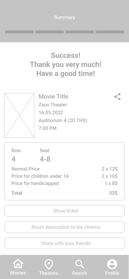
- Changed the icon label from "Movies" to "Home" to simplify navigation back to the home screen.
- Removal of the back arrow in the upper left corner when the order is completed. (6-Summary)
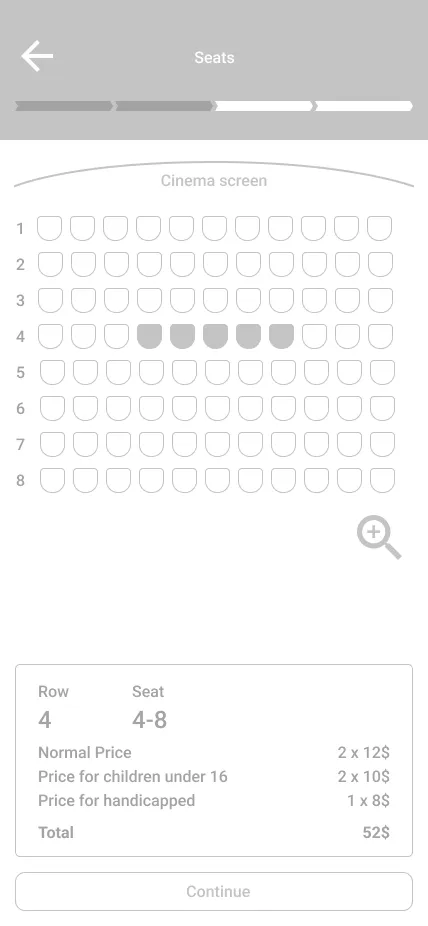
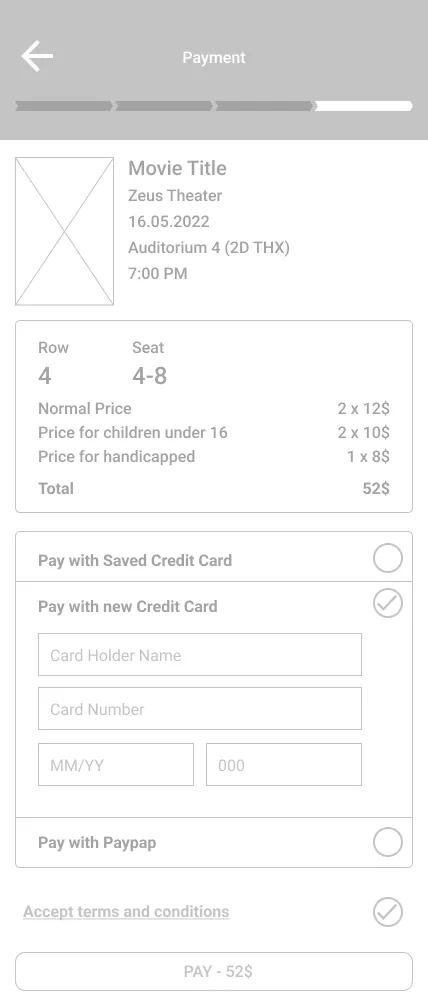
High Fidelity Prototype
7. Key results
It was an exciting journey through the design thinking process. The process was quite strictly defined by the Google course, so you couldn't make any big variations in the process.
The result is a great product that covers the needs of the customer. I was not able to measure KPIs here because it was not a real product. I was happy with the very positive feedback from the usability test, even though I would have liked to test with the high-fidelity prototype as well.
More Projects
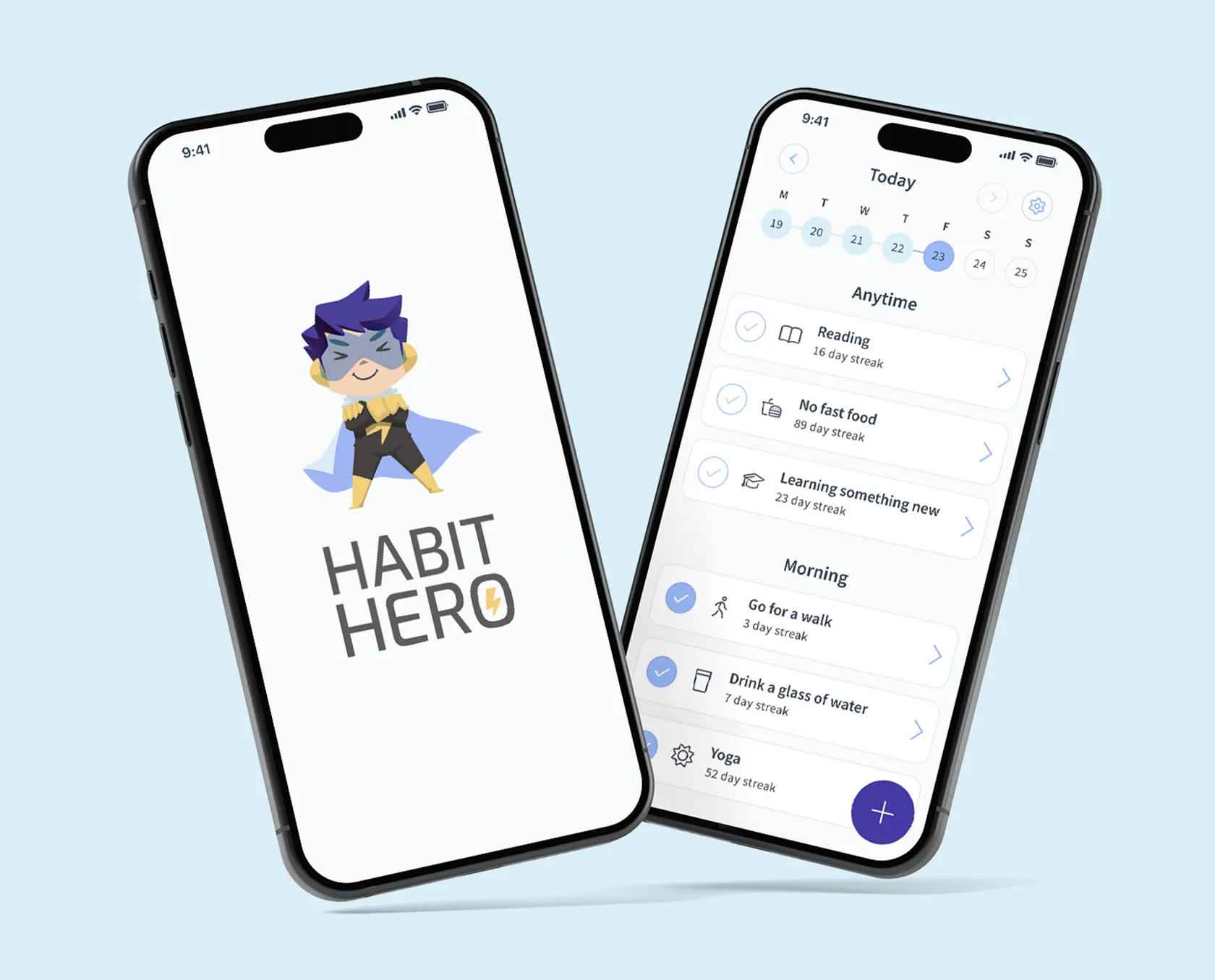
HabitHero
The focus of this project was to develop an app for cultivating habit development, taking into account both user needs and scientific knowledge. The app aims to make creating and sticking to habits easy and offers a catalog of ready-made habits, routines, and a mood tracker. It incorporates gamification elements and storytelling to motivate users. I conducted foundational research and interviews and created user personas and journey maps. The value proposition was defined, and the ideation involved merging user data with scientific evidence. The project successfully merged user needs and scientific insights into a unique habit app.
View Project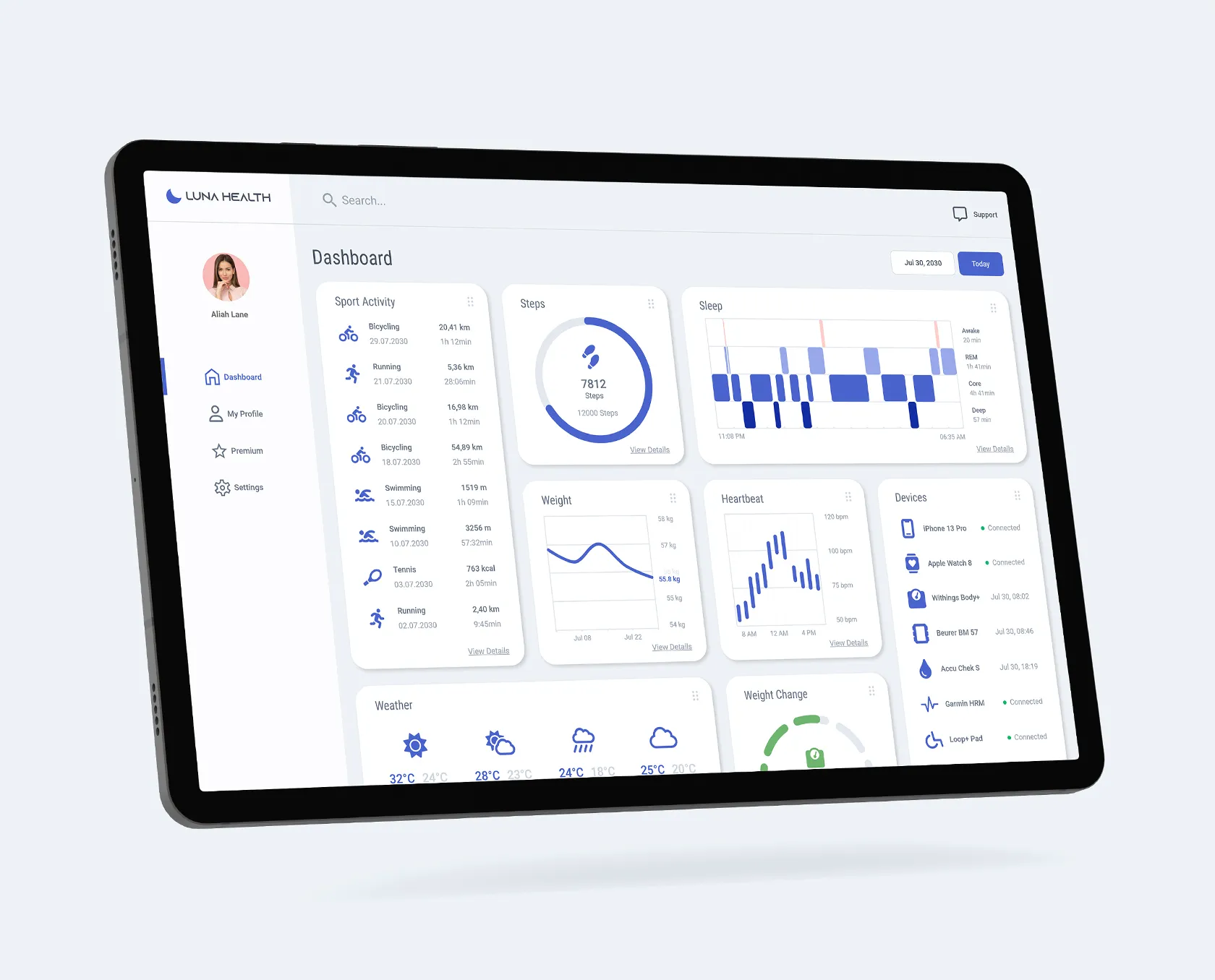
LunaHealth
The project's primary objective was to create an inclusive web app for tracking health data in a user-friendly manner, especially focusing on people with disabilities who are often sidelined or even excluded from health apps. The solution resulted in a clean web app that catered to user needs, with detailed information accessible through tiles. The design process involved empathizing with various user groups through interviews, defining pain points, and creating personas. Competitive audits and research informed the ideation phase, leading to a high-fidelity prototype.
View Project