Role:
UX/UI - Design
Google Professional Certificate Project
Duration:
2022 - 5 Weeks
Tools:
Adobe XD, Figma, Adobe Illustrator, Blender
Challenge
The challenge was to create a web app that collects health data and presents it in a user-friendly way. The goal was to maximize the inclusion of groups such as people with disabilities, who are almost always excluded from health apps. The app should be both motivating and present the collected data very well. The collected data should be easy to send to physiotherapists or doctors.
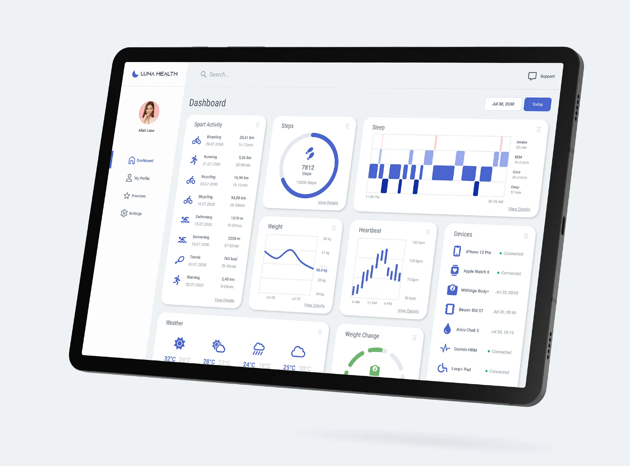
Solution
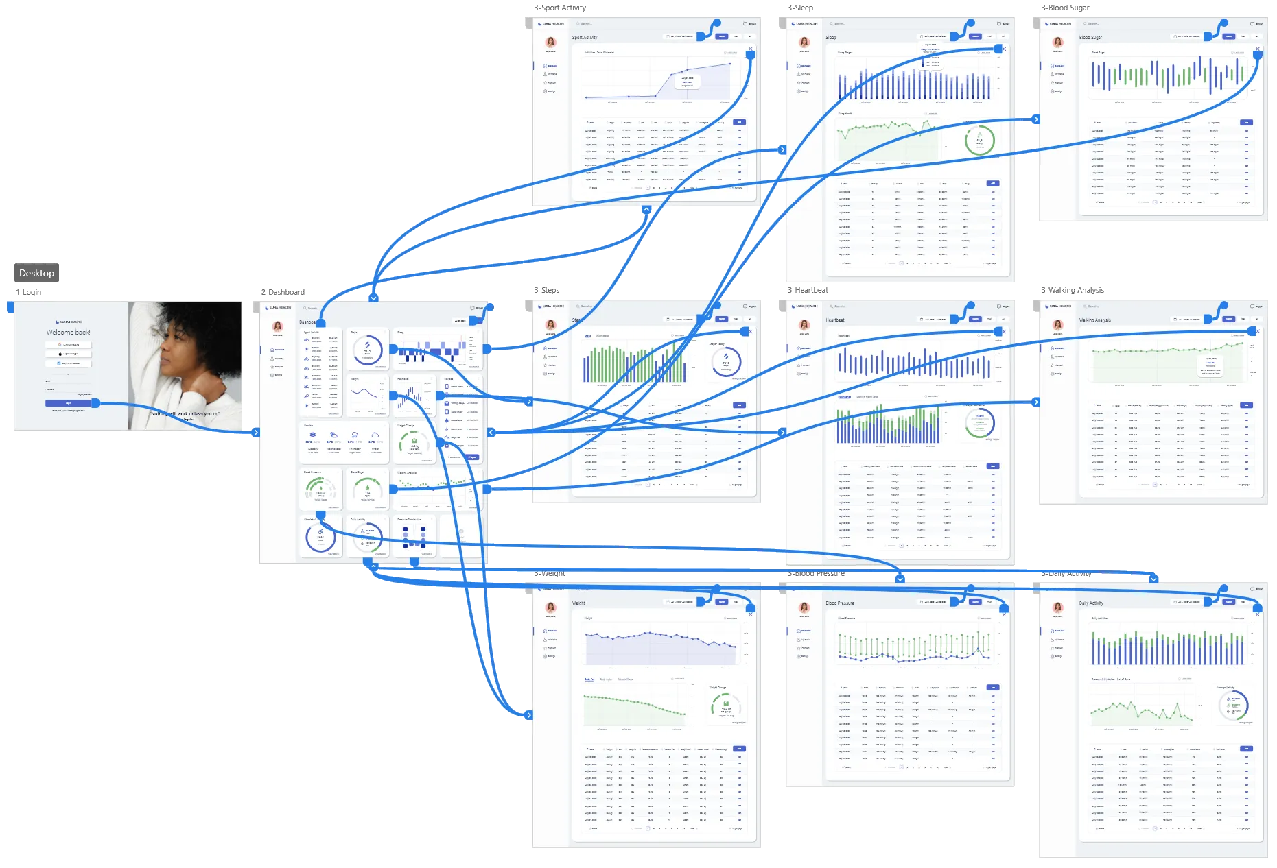
The journey led to a very clean web app that covered the needs of the user. The tiles in the app should function as portals, providing users with a snapshot view that leads directly to more comprehensive information and the underlying data. Through the intensive research I was able to discover many new needs, especially from wheelchair users, which I was able to include in the design.
Show PrototypeMy Role
In my role as the lead product designer for this project, I had full responsibility for its development. This project was a part of Google's professional certification program, leading me to embark on the design journey independently, without the assistance of a dedicated team for collaborative engagement in the design thinking process.
Design Thinking


1. Empathize
To understand the users, I conducted interviews. I was able to meet a very good variation of participants as I also have contacts with disabled athletes. This input was very important for me to keep the focus of the project in mind.
Interview
I interviewed eight people who do sport and take care of their health for very different reasons. This gave me a very good overview of the needs of the users and led me to completely new insights. For example, which relevant factors are important for tracking the health data of disabled people.
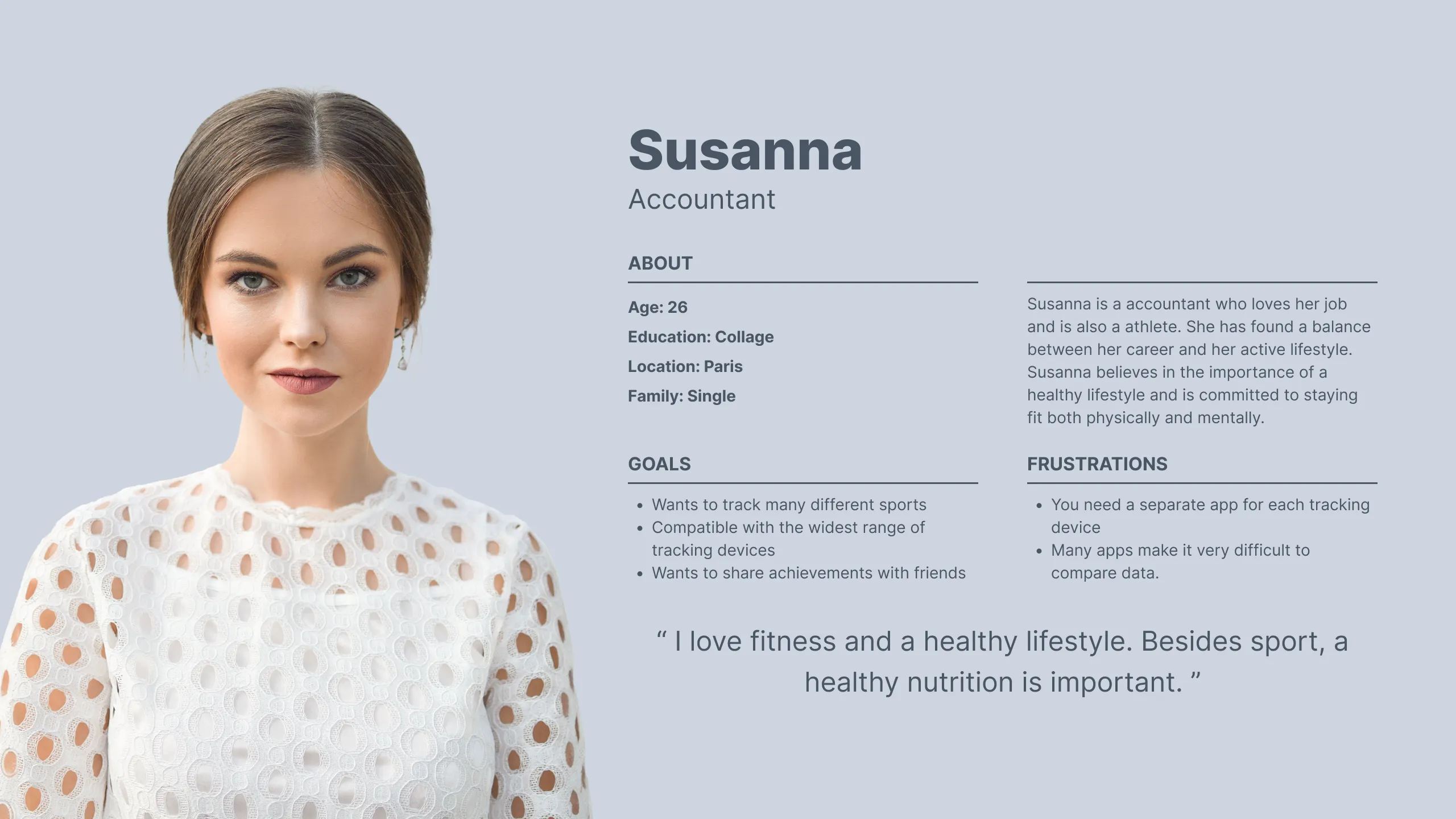
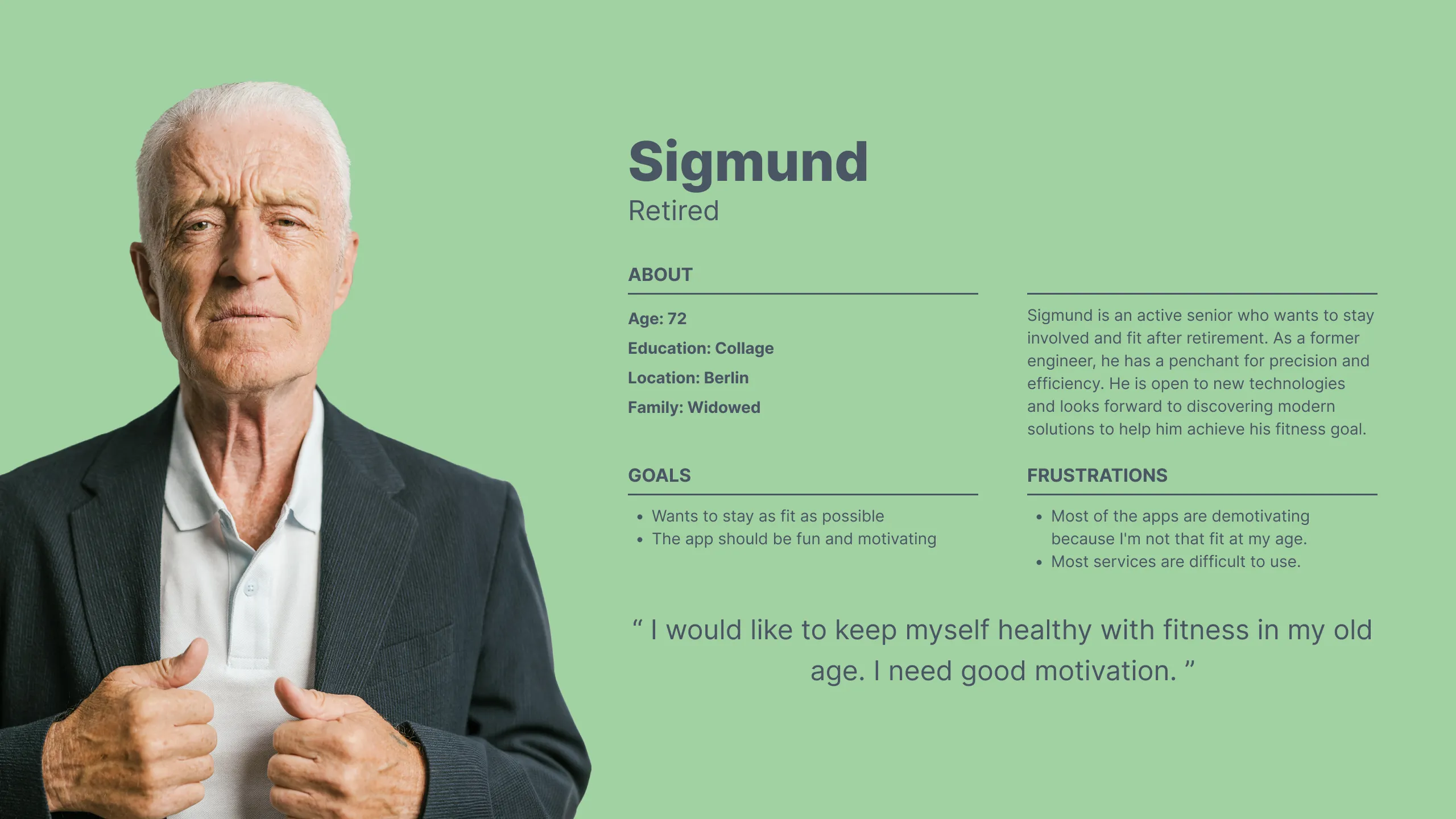
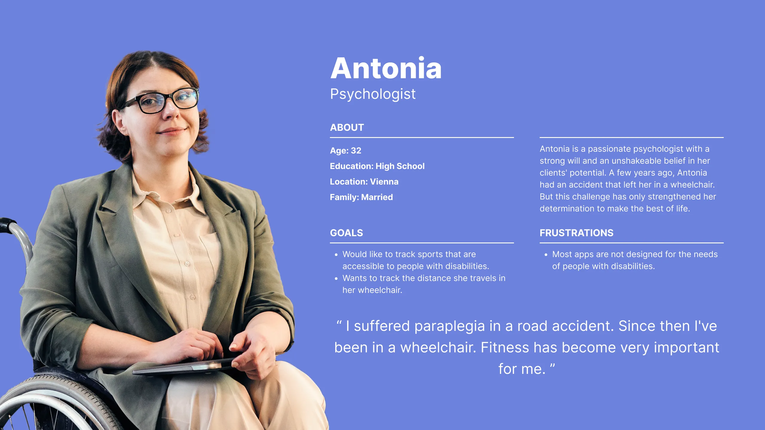
Personas

2. Define
In the define process, it is important to identify the users' pain points to minimize them. It is all about the following questions:
- What are the pain points you’re trying to solve?
- Where is the user when they’re using the product?
- When does the problem occur?
- Why is the problem important?
- How are users reaching their goals by using the product?
Problem Statement
Susanna is a health-conscious accountant who needs an app that tracks many different sports because she doesn't want a separate app to track each sport and every possible health data point.
Sigmund is a retiree who needs an app that motivates him to stay as fit as possible, as most apps do not address the sporting goals of older people.
Antonia is a married psychologist who needs an app to track sports for people with disabilities because none of the major apps are designed with the needs of people with disabilities in mind.
Thomas is a middle-aged programmer who needs a good overview of his health data because he is more motivated when he has a good overview.
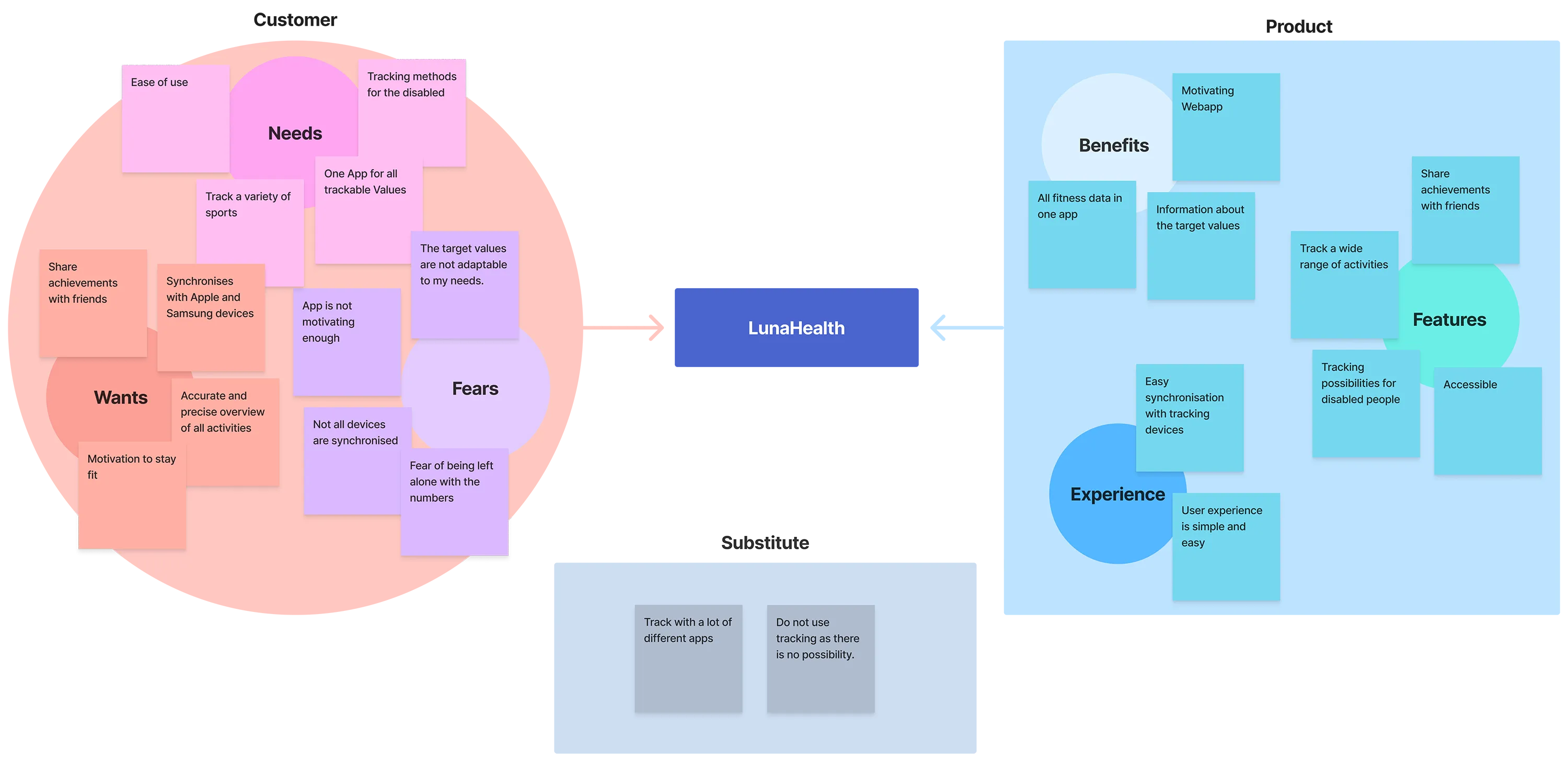
Value Proposition
As a UX designer, I want to create products that offer clear value for users. I was able to create a very good value proposition here. I addressed the needs, wants and fears of the users, and the features and benefits of the future product.
This is the basis for the next step in the journey.
3. Ideate
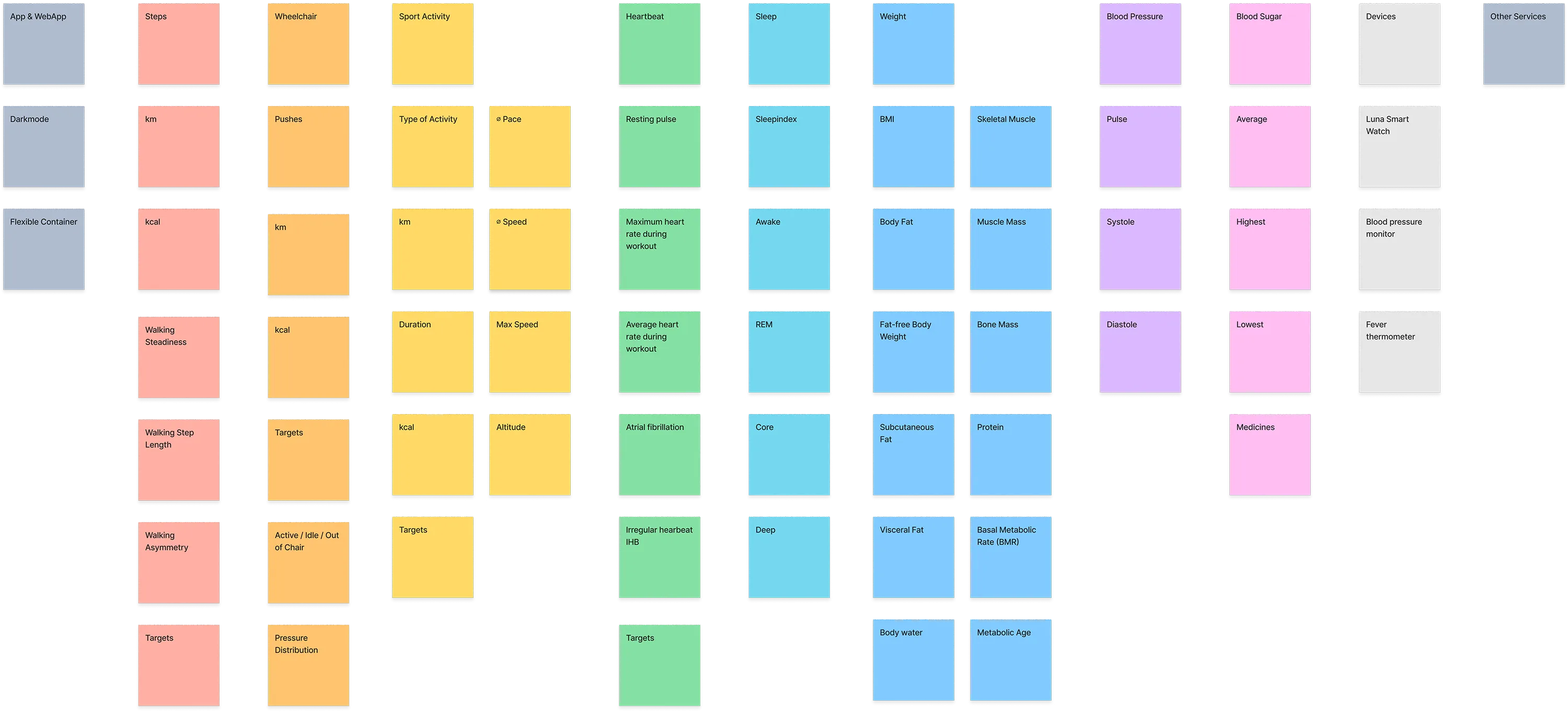
Having arrived at one of the most exciting topics in the process, the next step was to gather ideas. This involved a lot of detail because health issues are very technical. Which values are important to track, and which values can be tracked at all? What is possible and what are the user needs?
Competitive Audit
Of course, the world's major software and hardware manufacturers (Apple, Google, Samsung, etc.) have played a role here for many years, and the topic of health and health trackers is one that engages users. Interestingly, of all these major companies, only Fitbit operated a web app. All other manufacturers limited themselves to an app and did not have a web app. So, the idea of LunaHealth had a niche with little competition.
Detailed competitive audit| Apple Health | Google Fit | Fitbit | Samsung Health | |
|---|---|---|---|---|
| Business Size | large | medium | small | small |
| WebApp | - | - | Need work | - |
| Target audience | Apple User | General public | General public | General public |
| Unique value proposition | Good UI. Precise measurements | Good UI | Very good UI/UX | Good UI |
| Features | Outstanding | Outstanding | Outstanding | Outstanding |
| Brand Identity | Outstanding | Outstanding | Outstanding | Needs work |
| Tone | Serious and direct | Serious and direct | Friendly and direct | Serious and indirect |
Affinity Map
4. Prototype
Now it was time to build the prototypes. I already had a very clear idea of the interface. I was able to refine and realize it here.
Paper Wireframes

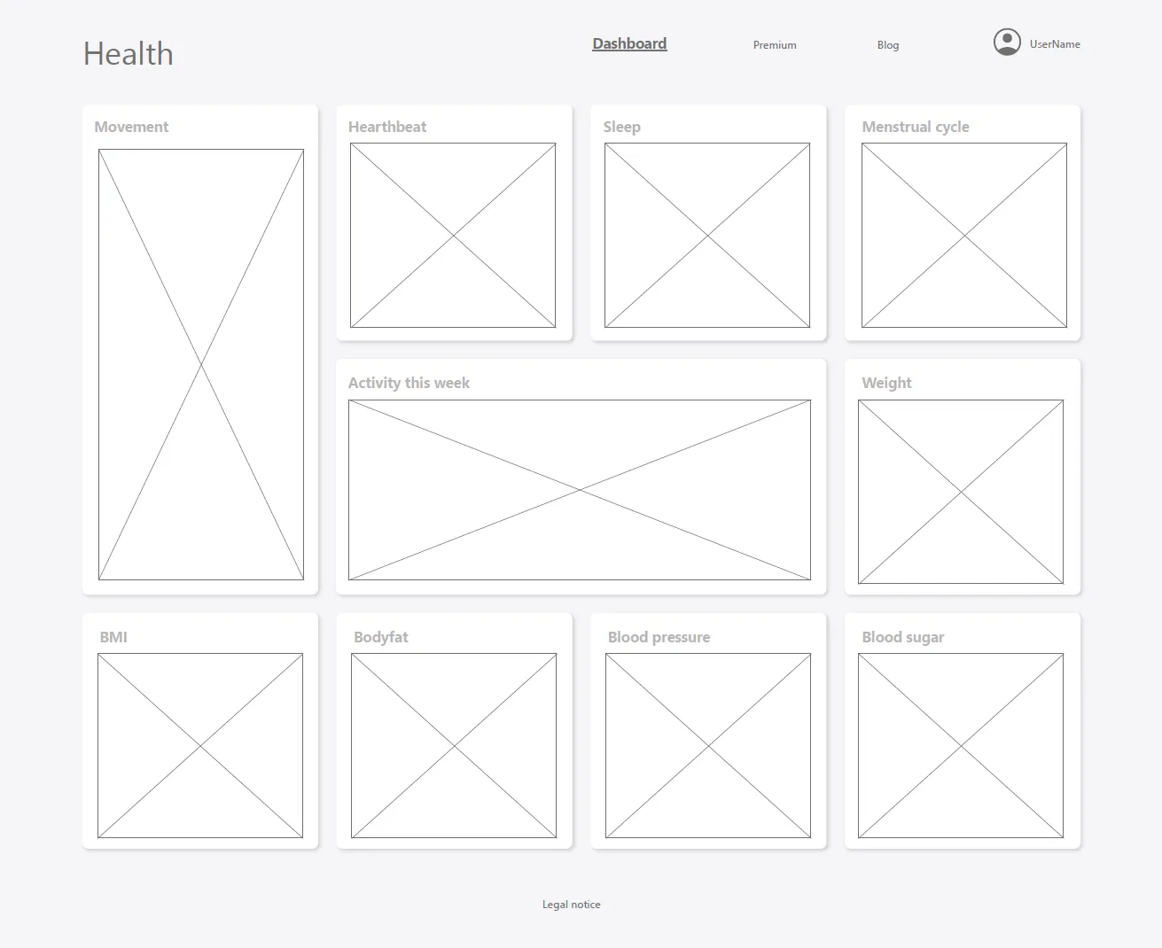
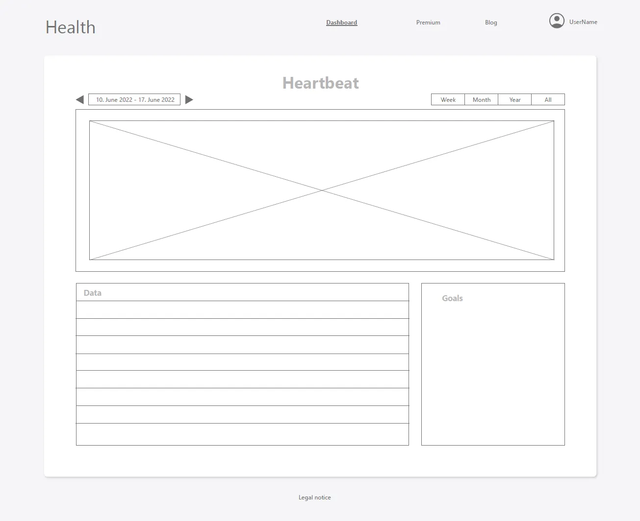
Digital Wireframe
As the application is very data-heavy and also relies on a lot of data-visualization, I decided to focus the wireframes on the layout, which was very simple and straightforward.
High Fidelity Prototype
5. Test
Now it was time for testing to find out whether my web app would work as I had imagined. To find out, I conducted usability tests.
This gave me some good insights.
Usability Study Note
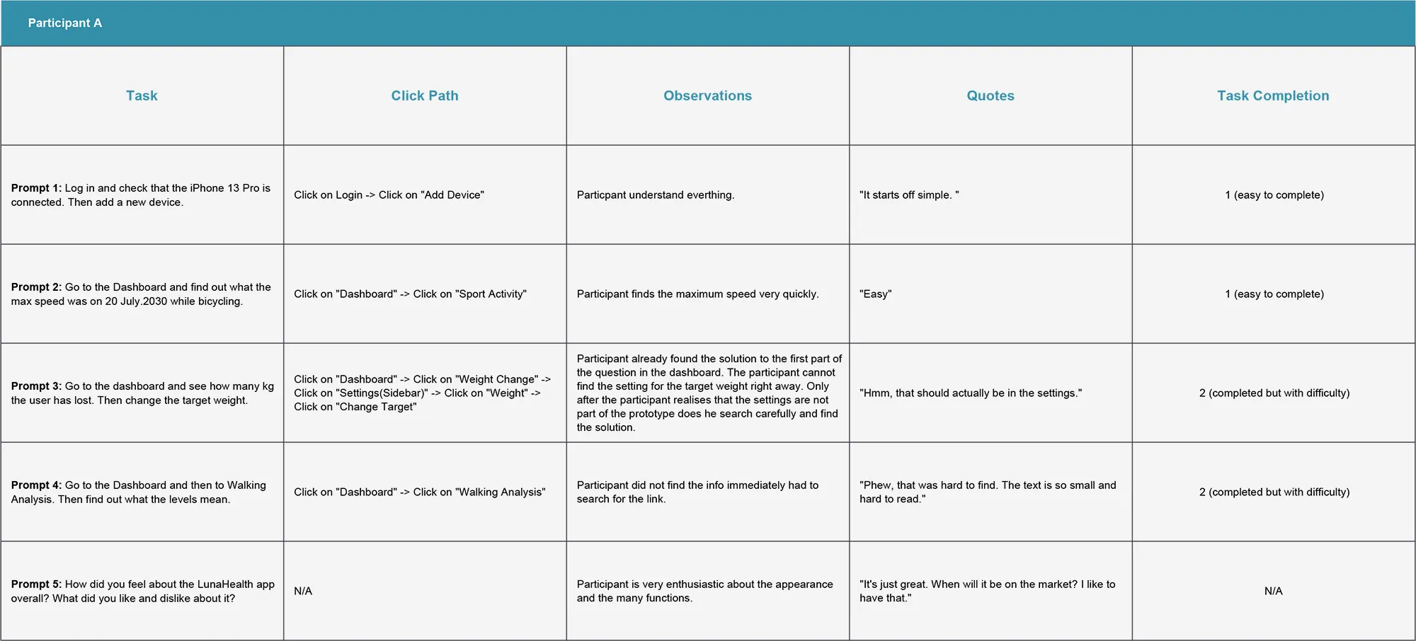
Insights
Most users were very enthusiastic about the prototype. One even asked when the app would be launched. For me, however, it was much more important to find out what the problems were. Two issues emerged here.
Customers should be informed about the exact meaning of the numbers. For this purpose, there are "Learn More" buttons in the prototype for the different topics that invite the customer to access the small knowledge platform behind the interface.
- However, most users were unable to find this "Learn More" button.
- Also, most participants did not find the settings to change the targets.
Pattern Identification
- It was observed that 3 out of 5 participants had problems finding the settings for the targets. This means that the link to the target settings is not visible enough for most users.
- It was observed that 4 out of 5 participants had problems finding the “Learn more” button. This means that the link to the extra information is not visible enough for most users.
- It was observed that 4 out of 5 participants find the webapp very clear and would like to use it in the future. This means that the app is useful for most users.
Insight Identification
- Most users struggled to understand how to set the target settings. The insight derived from this was that target settings should be included in the general settings.
- Users often did not know where to find additional information. The insight derived from this was that a dedicated section, such as a blog, is needed for users to easily find all extra information.
- While the majority of users found the web app easy to use and clear, the insight here was that a simpler design is necessary so that everyone can follow the process with ease.
Future Improvements
- Create a "Knowledge Base" menu item
- Make the "Learn More" button more visually prominent
- Target settings also need to be more visually prominent
6. Key results
I learned a lot from this project, such as the importance of research and including all people. The disabled participants in the research felt completely excluded from mainstream applications because they were not part of the ecosystem of the big players. This made it all the more important for me to create a user experience that was inclusive and motivating. I think I succeeded in that.
More Projects
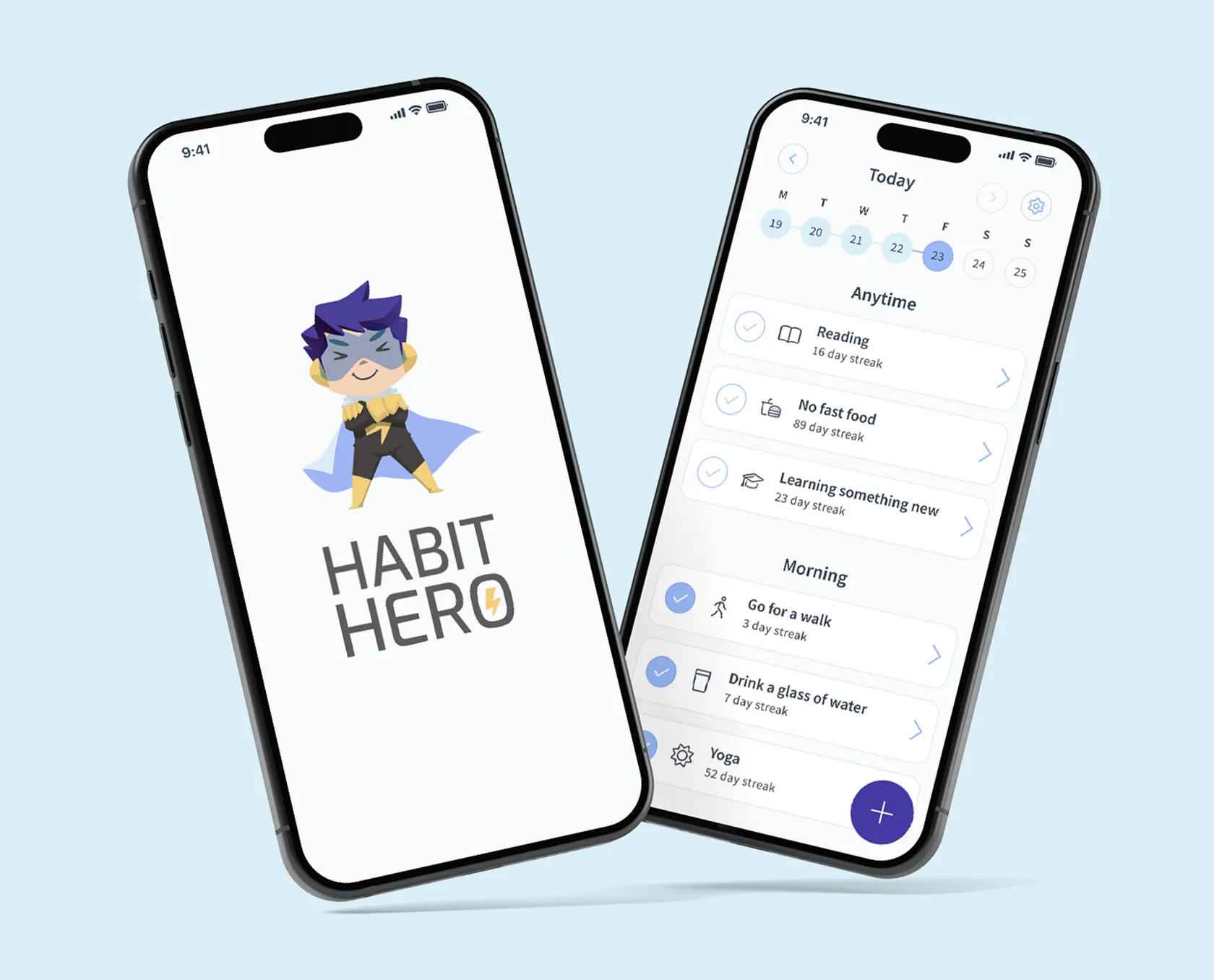
HabitHero
The focus of this project was to develop an app for cultivating habit development, taking into account both user needs and scientific knowledge. The app aims to make creating and sticking to habits easy and offers a catalog of ready-made habits, routines, and a mood tracker. It incorporates gamification elements and storytelling to motivate users. I conducted foundational research and interviews and created user personas and journey maps. The value proposition was defined, and the ideation involved merging user data with scientific evidence. The project successfully merged user needs and scientific insights into a unique habit app.
View Project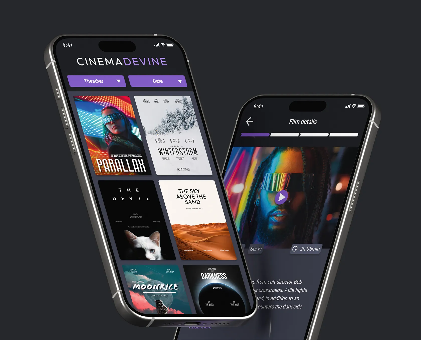
CinemaDevine
This was my first project for the Google Professional Certificate, where I applied the Design Thinking Framework to create an app for a fictitious cinema company called Cinema Devine. The goal was to understand users' needs and challenges to create a user-centric, data-driven, and uniquely branded app. I conducted interviews, created data-driven personas, problem statements, and a value proposition list. The ideation phase involved brainstorming, competitive audits, and user flow planning. I designed wireframes and prototypes, and in the testing phase, conducted a UX research study, identified insights, and made improvements.
View Project